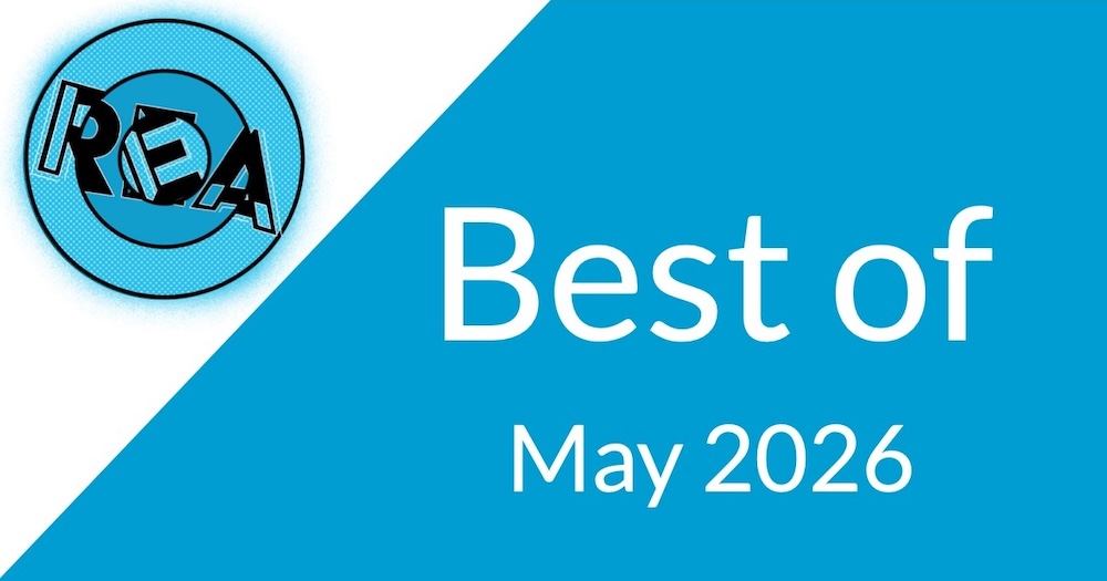
Room Escape Artist is going on two years old; we figured it was time for a redesign.
![]()
Our good friend and my colleague Mason “The Coding Designer” Wendell was kind enough to redesign our branding. He did a wonderful job creating something special after we told him that he couldn’t use any escape room logo cliches:
- Locks
- Keys
- Doors
- Figures exiting doors
- Puzzle pieces
Saying goodbye to our old and secretly funny logo
Our site’s look began with vandalism.
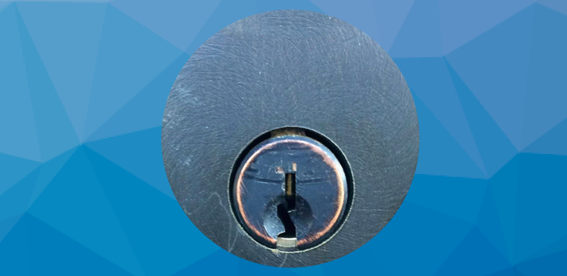
Back in 2014 we were building our site while visiting my parents. We had a lot of content ideas and hadn’t put much thought into branding.
We needed a logo.
I opened up the front door to my parents’ house, snapped a photo of their keyway, threw a circular mask on it, and called it a logo.
Then we needed colors. My parents had a blue door and it looked good with the lock, so blue it was.
The funny thing was that their door was blue because years earlier, when my brother was in high school, he had pissed off some kids (not an uncommon occurrence). These kids decided to express their anger at my brother by vandalizing my parents house. Their chosen method was a paintball drive-by.
The next day my mom went outside to clean up the mess and saw the blue paint on the door. Her response was, “I’d never have put it there, but it looks great.” She painted the whole door blue.
The color will remain; the lock logo will not.

![Dropout – Game Changer: Home Edition Kickstarter [Review]](https://roomescapeartist.com/wp-content/uploads/2026/05/game-changer-dropout-1.jpg)
Leave a Reply