I stumbled up on a video that explored the creation of the radiation and biohazard symbols.
In addition to some compelling history, this video posed an interesting question:
Can we create a universal warning symbol that will last forever?
Personally I think that the answer is no… but that’s besides the point.
All of this got me thinking about danger symbols in escape rooms and the common “do not touch” sticker.
Common Danger Symbols
Context is everything… and universality isn’t a thing with symbols.
In an escape room, symbols for radiation, biohazard, high voltage, or the classic Jolly Roger communicate nothing but setting.
If someone were to put actually hazardous materials in an escape room and label them appropriately… everyone who played the game would die. There is an assumed safety. It’s normal to assume that anything threatening is there for immersion’s sake…
Unless that symbol is a “do not touch” symbol.
Do Not Touch!
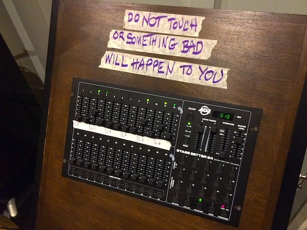
Do not touch stickers are a fairly common escape room mechanic where a sticker applied to a prop signifies that the item is in one way or another out of play.
These stickers come in different varieties including colored dot stickers, the company’s logo, the classic hand in a circle icon, and tape that has the words “Do Not Touch” on it.
Since these stickers first started appearing in early escape rooms, these symbols have been fraught with problems.
Fuzzy Meaning
Does “do not touch” mean, this item is completely out of play? Or does it contain visual information, but I do not need to touch it to find that information?
After playing some 700 escape rooms, I still ask to clarify the meaning of a “do not touch symbol” in an escape room. The meaning changes from company to company and sometimes even from game to game within one location.
For those of us who actively try to follow the rules, sometimes this is difficult to do.

Visual Identification
Sometimes these symbols are easy to miss. Maybe they are a tiny blip on a large object. Maybe I’m thoroughly in the zone and I don’t see it.
On multiple occasions, I’ve been guilty of not seeing a “do not touch” symbol until after I’ve already touched. (I always feel bad.)
Similarly, I’ve been in rooms where most of the wall hangings have “do not touch” stickers on them, but one or two don’t (because they are in play)… but I looked at the ones that I could interact with first and then assumed that all of the wall hangings were in play.
One thing to remember when gamemastering for “do not touch” violations is tone and word choice. It sucks when a gamemaster assumes that the player touching something with a “do not touch” sticker is dumb or deliberately breaking the rules. There’s a difference between a player deliberately prying something open and player confusion.

Immersive Damage
On the flip side, if the “do not touch” symbols are too big, too numerous, or too ugly, they can damage the aesthetic appeal of the game.
Sure, there’s no excuse for missing the symbol… but at what cost?
Inconsistency
I’ve been in games where a red dot sticker signified do not touch, but once I started playing, I saw an entire rainbow of dot stickers. Did they all mean “do not touch” or was it just the red ones? Is this a puzzle? A test? Or shoddy craftsmanship?
The answer is almost always the latter… but nevertheless it’s confusing and it undermines the intent behind the symbol.
Suggested Solutions
I have a few suggestions to mitigate these problems:
Build Stronger
It’s easy to say, but hard to do. Build it better… especially if it is a core piece of game functionality.
It’s baffling when the most interesting and important interactions are also the ones that we’re not supposed to handle. Escape rooms are a tactile adventure… or at least they are supposed to be.
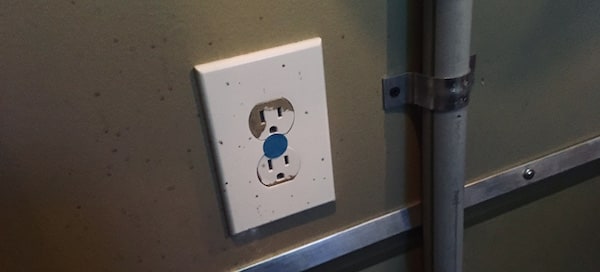
Hide the wires and anything else that we might be able to unplug, disconnect, or break.
If your local code will allow you to cover outlets, do it.
Draw Attention Deliberately
A lot of the “do not touch” stickers that we find are on props that are only in the game for ambiance.
One sure sign of a weak game is useless decor that looks more interesting than the actual game mechanisms. It’s games like these that are usually overflowing with “do not touch” symbols because the things that we players want to touch and fiddle with are useless… and it’s easier to accidentally break a curious object that has no purpose than one that clearly has intent.
Be Clear
If you need to use a “do not touch” symbol, use it sparingly and clearly. Define specifically what it means.
I personally prefer these symbols to mean that the flagged item is completely out of play because it means that players aren’t forced to parse meaning at all.

If you’re going to use a lock for reset or gamemaster access purposes, consider a lock that looks nothing like anything else in play. I am a fan of these Master Lock 410s.
I don’t think that there is anything inherently wrong with flagging something, but do it smartly, do it cleanly, and make sure that it’s effective.
As a thank you to our Patreon backers, we shared this post with them early and asked for their input! Please consider supporting us on Patreon.


![MysteryXcape – The Vanishing [Hivemind Review]](https://roomescapeartist.com/wp-content/uploads/2026/06/the-vanishing-the-vanishing-1.jpg)
Leave a Reply